Hand Lettering Tips for Your Sketchbook Pages
Welcome to Draw Tip Tuesday!
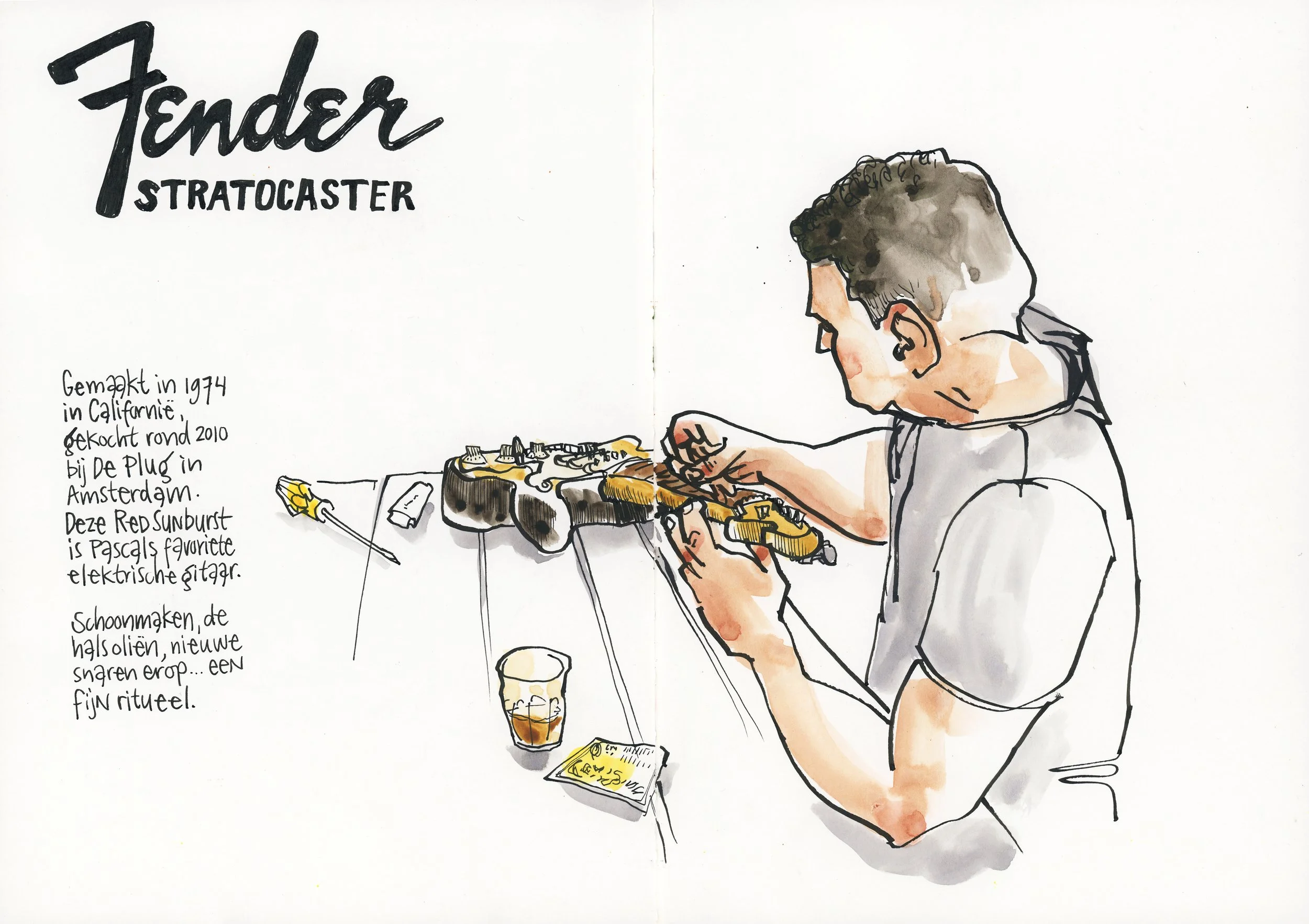
Lettering is such a fun way to add story and personality to your sketchbook pages.
Lettering can be part of the drawing instead of added as an afterthought. Even when you're insecure about your handwriting, or afraid you'll "mess up" a nice drawing... It is all just lines and shapes.
Play with size, spacing and placement to create more lively and more balanced pages.
Imperfections make everything feel more personal. And when you copy lettering, that's an easy way to study styles, find inspiration and build a little "library of letters" you might use later.
At the end of the video, I give you a fun assignment, for your sketchbook practice.
Watch how I add shadows to lettering in this video.
If you want to try brush lettering, you can watch this video next.
Lettering adds variety and extra information to your drawings.
It does not need to be perfect. It just needs to be yours.
Materials used in this video:
Hahnemühle Nostalgie sketchbook, size A5
Sailor Fude fountain pen (55° nib) with Platinum Carbon Black ink
Daniel Smith watercolors
Pentel Aquash waterbrush
Pink Pig sketchbook, size A6
Cretacolor Mega Nero Soft Pencil
Uniball Eye rollerball pen
For pro-tips, more videos, assignments, inspiration and ideas, and a wonderful community of artists like you and me, join me on Patreon!