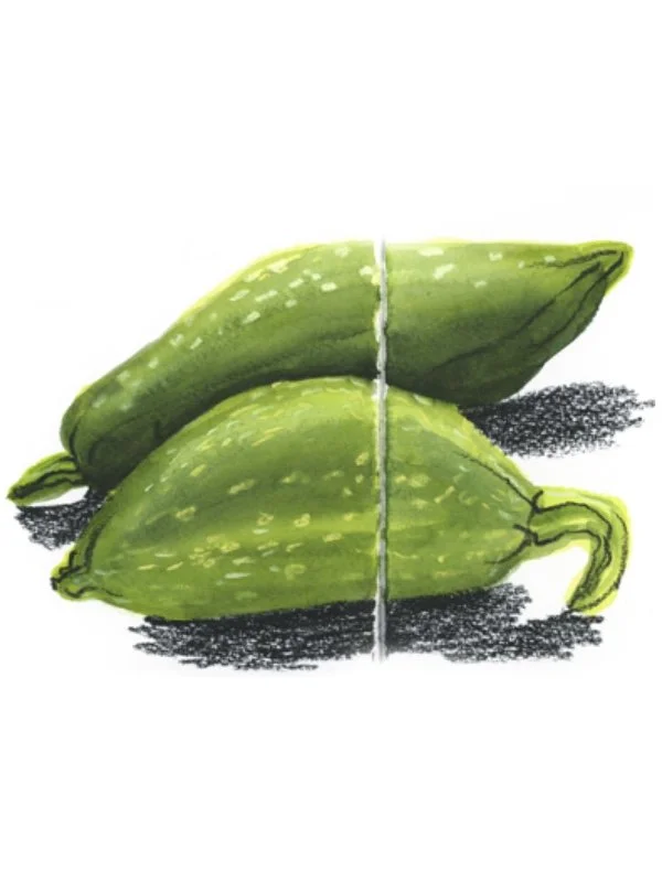

Why Shadow Should Never Be an Afterthought
You've been asking how I approach shadow in watercolor, so I made this video for you.
Materials I use in this video:
Hahnemühle 100% cotton watercolor book
Faber-Castell Pitt Oil Black Pencil, extra soft
Watercolors and water brush pen
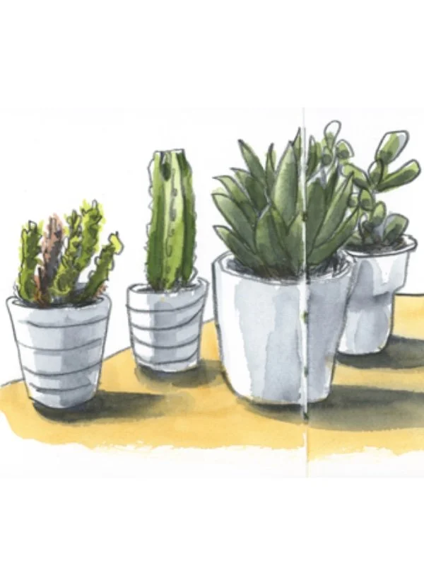
I sketch a few potted plants from a reference photo, keeping things loose. Then I work out the light and shadow first with a simple grey wash before any color goes down. I used indigo and Van Dyke brown, though any blue and brown mix works for an endless variety of grey washes.
That order matters more than you'd think. Once the grey wash sets the structure, the color you add afterward does so much of the work for you, and the whole piece comes together faster and feels more alive. It's a small shift in process that makes a big difference in the result.
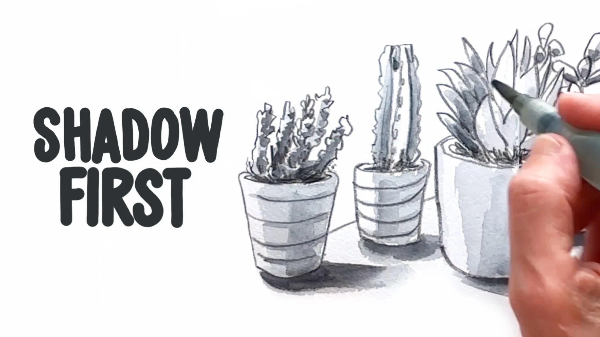
Click the image to watch the video
A few tips worth knowing:
Shadow shouldn't be an afterthought, it adds real depth and atmosphere
Watercolor dries lighter than it looks when wet, so don't be shy with pigment
Skip the black for your shadows, grey reads much softer and more natural
For the assignment I give at the end of the video, you can also download the free reference photo I used today on my Patreon page.
And if you want to go deeper into seeing light and shadow, I made this explainer video with a demo.